Why user experience matters: boost sales on Magento & Shopify
TL;DR:
- Nearly 70% of online shopping baskets are abandoned, costing UK ecommerce businesses millions annually.
- Improving UX by simplifying checkout, displaying costs early, and optimizing mobile can significantly boost sales.
- Ongoing UX management and expert support are essential for sustained ecommerce growth and higher conversion rates.
Nearly 7 out of 10 shoppers abandon their online baskets before completing a purchase. That is not a rounding error — it is a structural problem costing UK ecommerce brands millions in lost revenue every year. The frustrating truth is that most of these abandonments are entirely preventable. Slow pages, confusing navigation, surprise delivery charges, and clunky checkouts are not technical inevitabilities. They are fixable. This guide breaks down what user experience (UX) actually means in ecommerce, why it has such a direct effect on your bottom line, and what you can do right now to start recovering those lost sales on Magento and Shopify.
Table of Contents
- What is user experience and why does it matter in ecommerce?
- The business impact of strong versus weak user experience
- Key elements of great UX for Magento and Shopify sites
- Practical steps to improve user experience and boost sales
- A fresh look: what most ecommerce brands miss about user experience
- Supercharge your site’s UX with expert support
- Frequently asked questions
Key Takeaways
| Point | Details |
|---|---|
| Cart abandonment is costly | Ignoring user experience leads to high rates of lost sales for UK ecommerce sites. |
| Top UX fixes boost sales | Streamlined checkouts and clear information significantly improve conversion rates. |
| Small changes have big impact | Addressing common UX pain points can quickly increase customer satisfaction and loyalty. |
| Magento and Shopify need tailored UX | Each platform benefits from unique tweaks and ongoing optimisation for the best results. |
What is user experience and why does it matter in ecommerce?
User experience, or UX, refers to the complete journey a shopper takes when they interact with your online store. It covers everything from the moment they land on your homepage to the second they receive their order confirmation email. In digital retail, UX is not just about how your site looks. It is about how it feels to use.
Think of it this way: a beautifully designed store that takes eight seconds to load, hides delivery costs until checkout, and forces shoppers to create an account before buying is still a bad experience. Aesthetics without function is just decoration.
“Good UX is invisible. Shoppers do not notice it when it works. They only notice when it does not.”
For UK ecommerce brands, this matters enormously because British shoppers are increasingly unforgiving. If your site creates friction, they will leave and buy from a competitor within seconds. The data is stark. The top abandonment reasons are:
- Extra costs (48%): Unexpected delivery or VAT charges revealed late in checkout
- Forced account creation (26%): Shoppers resenting the obligation to register before buying
- Long checkout processes (22%): Too many steps, too many fields, too much friction
These are not edge cases. They are the norm for under-optimised stores. Every one of those percentage points represents real customers who had intent to buy and walked away.
UX also shapes trust. A store that feels disorganised, slow, or confusing signals to shoppers that the brand behind it may not be reliable. Conversely, a clean, fast, and intuitive store builds confidence before a single product is added to the basket. That trust directly influences ecommerce conversions and loyalty, making UX one of the highest-leverage investments you can make.
For Magento and Shopify merchants in particular, the platform gives you the tools. But tools alone do not create great experiences. Thoughtful design, clear information architecture, and a genuine understanding of how your customers think and shop — that is what separates high-converting stores from ones that haemorrhage revenue. Understanding retail web design success starts with recognising that UX is a commercial discipline, not a cosmetic one.
The business impact of strong versus weak user experience
Let us be direct. Weak UX costs you money. Strong UX makes you money. The difference between the two is measurable, and the gap is often larger than most business owners expect.
Cart abandonment averages 70% globally, and UK ecommerce sits squarely within that range. If your store processes 1,000 basket additions per month and 700 of those shoppers leave without buying, even a 10% improvement in that figure means 70 additional completed orders. At an average basket value of £60, that is £4,200 in recovered revenue per month from a single metric.
Here is how strong and weak UX compare across the metrics that matter most:
| Metric | Strong UX | Weak UX |
|---|---|---|
| Conversion rate | 3% to 5%+ | Below 1.5% |
| Cart abandonment | Under 60% | 75% or higher |
| Repeat purchase rate | High, driven by trust | Low, driven by frustration |
| Average basket value | Higher (clear upsells) | Lower (confused journeys) |
| Customer support load | Lower (self-service works) | Higher (shoppers get stuck) |
The relationship between UX and improving customer loyalty is particularly important for growing brands. A shopper who has a smooth first experience is far more likely to return. One who struggled through a confusing checkout will not come back, and may leave a negative review.
To start shifting these numbers, prioritise the following:
- Audit your checkout funnel using Google Analytics or your platform’s built-in reporting to identify exactly where shoppers are dropping off
- Remove forced account creation or at minimum offer a prominent guest checkout option
- Surface all costs early — show estimated delivery charges on product pages, not just at checkout
- Reduce form fields to the absolute minimum required to complete a purchase
- Test on mobile — a significant proportion of UK shoppers browse and buy on smartphones
Pro Tip: Run a five-second test with someone unfamiliar with your store. Ask them to find a specific product and add it to their basket. Watch where they hesitate. Those hesitation points are your UX priorities.
The goal is to increase ecommerce conversions by removing every unnecessary obstacle between intent and purchase. Even small friction points compound over thousands of sessions.
Key elements of great UX for Magento and Shopify sites
Not all UX problems are the same, and not all platforms handle them identically. Magento and Shopify each have their own strengths and common pitfalls. Understanding both helps you make smarter decisions about where to focus your effort.
Complex checkouts and forced account creation remain the leading causes of abandoned baskets across both platforms. But the fixes differ slightly depending on your setup.
The core elements of great ecommerce UX include:
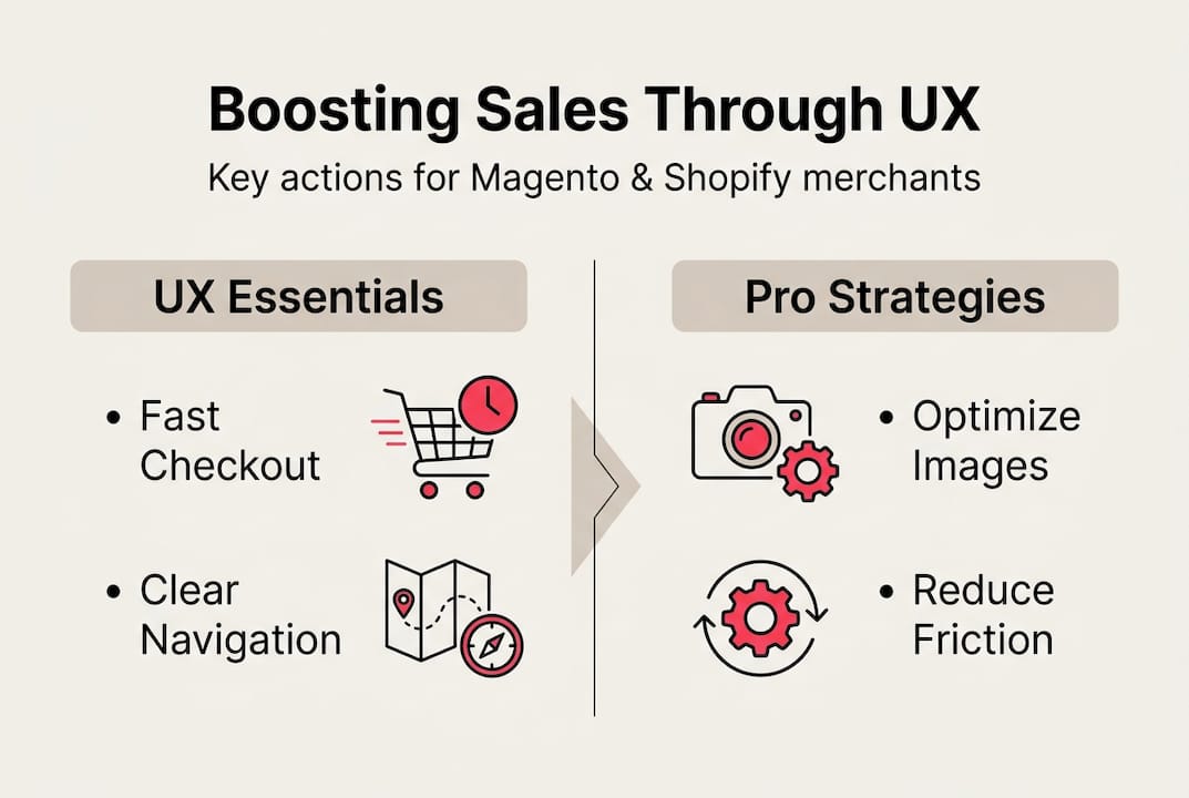
- Streamlined checkout: Fewer steps, fewer fields, clear progress indicators
- Mobile responsiveness: Layouts that work as well on a 375px screen as on a desktop
- Clear delivery and returns information: Visible before the shopper reaches checkout
- Fast page load times: Every additional second of load time reduces conversions
- Intuitive navigation: Shoppers should never have to think hard about where to go next
- Accessible design: Sufficient contrast, readable fonts, and keyboard-navigable interfaces
Here is how common UX flaws map to fixes on each platform:
| UX flaw | Magento fix | Shopify fix |
|---|---|---|
| Slow page loads | Implement Hyvä frontend | Optimise theme, compress assets |
| Forced account creation | Enable guest checkout in admin | Enable guest checkout in settings |
| Hidden delivery costs | Display shipping estimator on cart | Add shipping calculator to cart |
| Poor mobile experience | Responsive Hyvä theme build | Mobile-optimised theme selection |
| Weak product search | Integrate Klevu search | Integrate Klevu or native search |
For Magento merchants, the Hyvä frontend is genuinely transformative. Traditional Magento frontends can be slow and heavy. Hyvä strips that back to deliver lightning-fast page loads and a much cleaner user experience. It is one of the highest-impact upgrades available to Magento store owners right now.

For Shopify, the platform’s native checkout is already well-optimised, but theme choice and app selection matter enormously. A bloated theme with too many apps slows your store and creates inconsistent experiences.
Pro Tip: Use Figma to map your customer journey before making any design changes. Visualising the full flow from landing page to order confirmation reveals gaps that are invisible when you are looking at individual pages in isolation. This is exactly how we approach optimising store UX for our clients.
For a deeper look at what separates high-performing store designs from average ones, our UX design tips and top ecommerce design tips are worth exploring.
Practical steps to improve user experience and boost sales
Knowing what good UX looks like is one thing. Knowing where to start when your store has accumulated years of decisions, plugins, and patches is another. Here is a practical framework for getting moving.
Cart abandonment affects over 70% of shoppers, which means simplifying your checkout flow is almost always the highest-yield starting point. But do not stop there.
Step-by-step action plan:
- Set up funnel tracking in Google Analytics 4 or your platform’s analytics. Identify the pages where shoppers exit most frequently during the purchase journey.
- Run a UX audit of your checkout. Count the steps, the form fields, and the decisions a shopper has to make. Every unnecessary element is a risk.
- Check your mobile experience on a real device, not just a browser emulator. Tap every button. Try to complete a purchase. Note anything that feels awkward.
- Review your cost transparency. Are delivery charges, VAT, and any additional fees visible before the basket? If not, fix this immediately.
- Test your site speed using Google PageSpeed Insights. A score below 70 on mobile is costing you sales.
- Gather qualitative feedback using tools like Hotjar to watch session recordings and understand how real shoppers navigate your store.
- Prioritise and implement. Focus on changes that are low effort and high impact first. Guest checkout, cost transparency, and mobile layout fixes typically fall into this category.
Quick wins you can implement this month:
- Add a guest checkout option if you do not already have one
- Display a delivery cost estimator on the basket page
- Compress your homepage images to improve load speed
- Simplify your main navigation to seven items or fewer
- Add trust signals (reviews, security badges, returns policy) near the checkout button
For more structured guidance, our advanced UX improvement guide covers the full process in detail. And if you want to stay ahead of what is working in 2026, our web design trends resource is a useful reference.
Pro Tip: Do not try to fix everything at once. Pick the three highest-impact changes, implement them, and measure the effect before moving on. Incremental, evidence-based improvement beats a big redesign that you cannot attribute results to.
A fresh look: what most ecommerce brands miss about user experience
Here is something we see repeatedly when working with UK ecommerce brands: they treat UX as a design project. They commission a new look, launch it, and expect conversions to climb. Sometimes they do. Often, the underlying problems remain.
The real impact of UX is not visual. It is psychological. Shoppers make buying decisions based on how confident they feel, how much they trust the brand, and how little effort the purchase requires. None of those things are solved by a new colour palette.
We have seen brands invest heavily in beautiful design while leaving their checkout with eight steps, no guest option, and delivery costs that only appear at the final screen. The result is a stunning store that still haemorrhages revenue.
The brands that see genuine, sustained UX gains are the ones that treat it as an ongoing operational discipline. They review their analytics monthly. They test changes systematically. They listen to customer support queries as a signal of where the journey is breaking down. A spike in “where is my order” emails, for example, often points to a post-purchase communication gap — a UX problem, not a logistics one.
Shift your mindset from “how does our store look” to “how does our store perform for the person using it.” That single reframe changes everything.
Supercharge your site’s UX with expert support
Improving UX is not a one-time project. It is an ongoing commitment to understanding your customers and removing the obstacles between them and a completed purchase.

At Big Eye Deers, we specialise in designing, building, and supporting high-performing ecommerce stores on Magento web design and Shopify support platforms. Whether you need a full UX overhaul, a Hyvä frontend build, or targeted improvements to your checkout flow, we bring over 17 years of experience to every project. We use Figma to plan every user journey before a single line of code is written, ensuring your store is built around how your customers actually behave. Explore our UX tips or get in touch to discuss what better UX could mean for your revenue.
Frequently asked questions
What is user experience in ecommerce?
User experience in ecommerce refers to how easily and pleasantly shoppers interact with your online store, from browsing to checkout. It covers everything from page speed and navigation to cost transparency and mobile usability.
What are the top causes of cart abandonment in the UK?
The main causes are unexpected extra costs, forced account creation, and lengthy checkout processes. Addressing these three issues alone can make a significant difference to your conversion rate.
How quickly can UX changes improve sales?
Many ecommerce stores see uplift in conversions within weeks of streamlining checkout and clarifying costs. Quick wins like enabling guest checkout or displaying delivery charges early often show results within a single trading period.
Which platform has a better UX: Magento or Shopify?
Both platforms can offer excellent UX when properly configured. Shopify is quicker to optimise out of the box, while Magento offers greater flexibility for complex catalogues and B2B requirements. The key is thoughtful design and addressing platform-specific pain points.
Why should I invest in professional UX support?
Professional UX support helps pinpoint the specific issues impacting your sales and creates user journeys that drive measurable results. It removes the guesswork and ensures changes are grounded in data and experience rather than assumption.
Recommended
- Ecommerce UX: Boosting Sales and Customer Loyalty
- Ecommerce Consulting: Boosting Magento Success UK • Bigeyedeers.co.uk
- How to Optimise Online Store UX for Higher Conversions
- Hyvä for Magento: speed, sanity, and smarter storefronts • Bigeyedeers.co.uk
- Boutique cartes 2026 : +40% ventes avec optimisation – JM Cards


Adobe Commerce (Magento)
Formerly known as Magento, Adobe Commerce is built for complex catalogues, integrations, and long term growth. We design and develop stable, scalable stores that support demanding eCommerce requirements, including multi-store setups, complex pricing, and Hyva based performance improvements.

Bespoke Build
We design and build custom eCommerce platforms for businesses with complex workflows, integrations, or non standard requirements. Built from scratch around your business needs using Laravel and modern architectures.

Working with brands across the UK from our offices in Cardiff and Exeter, you deal directly with a senior team of designers and developers specialising in Shopify, Magento, WordPress and bespoke eCommerce platforms.
We focus on commercial outcomes. Better conversion rates, strong SEO foundations and eCommerce platforms that continue to improve long after launch.