How site architecture shapes ecommerce growth and sales
TL;DR:
- Ecommerce site architecture directly influences user experience, conversions, and search engine rankings, making it a vital strategic focus. Cross-functional collaboration and data-driven decisions are essential to build scalable, effective structures that reflect customer intent and support business growth. Regular audits, testing, and aligning technical with commercial insights enable continuous improvement and measurable revenue gains.
Site architecture is one of those things most ecommerce teams treat as someone else’s problem. The developers handle it, right? Wrong. Site architecture can make or break sales and user satisfaction, and the decisions behind it are as much commercial as they are technical. Whether you’re running a Magento catalogue with thousands of SKUs or a focused Shopify store with seasonal ranges, how you structure, label, and connect your content determines whether shoppers find what they need or leave for a competitor. This guide sets out exactly why architecture matters and, more importantly, what you can do about it.
Table of Contents
- What is ecommerce site architecture and why does it matter?
- User journeys: how architecture shapes experience and sales
- SEO power: the hidden influence of architecture
- Performance and revenue: ROI of architecture-led improvements
- Critical trade-offs and evidence-based decision making
- What most ecommerce teams miss about site architecture
- Need a hands-on site architecture partner?
- Frequently asked questions
Key Takeaways
| Point | Details |
|---|---|
| Site architecture shapes success | The way your site is structured is as critical to sales and SEO as your marketing or product range. |
| User journeys drive conversions | Logical navigation, clear filters, and helpful taxonomies make it easier for customers to buy and boost revenue. |
| SEO relies on structure | Crawlable, well-linked architectures help search engines surface your most important pages. |
| Improvements bring measurable ROI | Modern architecture can increase conversion rates and overall revenue, as case studies show. |
| Evidence beats trends | Successful ecommerce architecture evolves based on real user behaviour, not design fads. |
What is ecommerce site architecture and why does it matter?
Ecommerce site architecture is the overall system that governs how your store is structured, navigated, and experienced. It covers far more than your sitemap. Think of it as the blueprint that determines how every page connects to every other page, how categories and subcategories are labelled, how filtering and faceted search work, and how a shopper moves from your homepage through to checkout.
The scope includes:
- Navigation structure: Primary menus, mega menus, breadcrumbs, and footer links
- Taxonomy and categorisation: How products are grouped, labelled, and nested within parent categories
- Filter and facet systems: The attributes shoppers use to narrow results (size, colour, brand, price)
- URL and page hierarchy: The depth at which product and category pages sit within your domain
- Internal linking patterns: How category, product, and editorial pages reference one another
“Site architecture affects both user orientation and conversion friction.” This is the crux of it. When shoppers feel lost or uncertain, they don’t convert. They leave.
Get this right and the benefits cascade. Shoppers find products faster, add to cart with confidence, and complete purchases without second-guessing their choices. SEO performance improves because search engines can crawl your entire catalogue efficiently. Scalability becomes far less painful because your structure accommodates new categories and product lines without breaking existing journeys.
Get it wrong and you’re fighting a constant battle: high bounce rates on category pages, poor rankings for product-level keywords, bloated URL structures that confuse both bots and humans. Not good.
User journeys: how architecture shapes experience and sales
Having defined site architecture, let’s examine its direct impact on the journeys real shoppers take through your store, and where things fall apart.
Imagine a customer landing on your homepage looking for waterproof walking boots in a size 9. If your navigation routes them to a generic “Footwear” category with no sub-filtering, they’ll scroll through hundreds of unrelated products. That friction is costly. If, however, your architecture presents a clear path: Footwear > Walking Boots > Waterproof, with a size filter prominently displayed, the journey becomes effortless. The difference between those two scenarios can be the difference between a sale and a lost visitor.

Choice architecture improves legibility and purchase confidence in large ecommerce catalogues. The principle here is that how you present options shapes how shoppers decide. Grouping filters logically, labelling categories in plain customer language rather than internal jargon, and sequencing decision points to match real buying intent all reduce cognitive load significantly.
Common blockers we see consistently include:
- Unlabelled or vague category names that force shoppers to guess (is “Lifestyle” sportswear or homewares?)
- Filter systems that show zero-result combinations without warning, leading to dead ends
- Deeply nested subcategories that bury popular products three or four clicks from the homepage
- Inconsistent breadcrumbs that disorient shoppers returning from a product page
| Journey type | Friction level | Typical conversion rate | Cart abandonment |
|---|---|---|---|
| Streamlined: clear navigation, accurate filters | Low | 3.5% to 5.2% | 55% to 62% |
| Moderate: some filter issues, vague labels | Medium | 1.8% to 2.9% | 68% to 74% |
| High friction: deep nesting, no filters | High | 0.6% to 1.2% | 80%+ |
Pro Tip: Map three or four of your most common purchase journeys in Figma before making any navigation changes. Walk them step by step and note every point where a real shopper might hesitate or second-guess. Those hesitation points are your architectural priorities.
When thinking about optimising store UX, remember that filter design is often where the biggest wins hide. Filters that reflect real customer language, surface available stock accurately, and collapse neatly on mobile have an outsized impact on revenue per session. Pair these with retail website features like sticky navigation and persistent filter states and you dramatically reduce the drop-off that plagues category pages. It is also worth reviewing product page optimisation in tandem, since category architecture and product page design work as a system, not in isolation.
SEO power: the hidden influence of architecture
With user experience covered, here is the part many ecommerce leads underestimate: architecture is a foundational SEO lever, one that no amount of content writing or link building can compensate for if it’s broken.
Information architecture, internal linking, and taxonomy directly drive SEO for ecommerce. Search engines rely on your site structure to understand which pages matter, how topics relate to one another, and where crawl budget should be spent. A poorly structured site causes Googlebot to waste crawl budget on faceted filter URLs, paginated listing pages, and duplicate category pages rather than your most commercially important product and category pages.
| Architecture type | Crawl efficiency | Ranking potential | Scalability |
|---|---|---|---|
| Flat (2 to 3 clicks from homepage) | High | Strong for category and product pages | Excellent |
| Deep (4+ clicks from homepage) | Low to medium | Weaker for deep product pages | Poor without redirects |
Key SEO best practices tied directly to architecture:
- Canonical tags: Apply these to paginated listing pages and filtered URL variants to prevent duplicate content penalties
- Crawl directives: Use robots.txt and noindex tags to keep irrelevant or low-value filter combinations out of the index
- Internal linking from editorial content: Blog posts and buying guides should link directly to relevant category pages, passing authority down the hierarchy
- URL structure: Keep URLs short, descriptive, and consistent with your taxonomy (for example, /footwear/walking-boots/waterproof/ not /cat/123/sub456/)
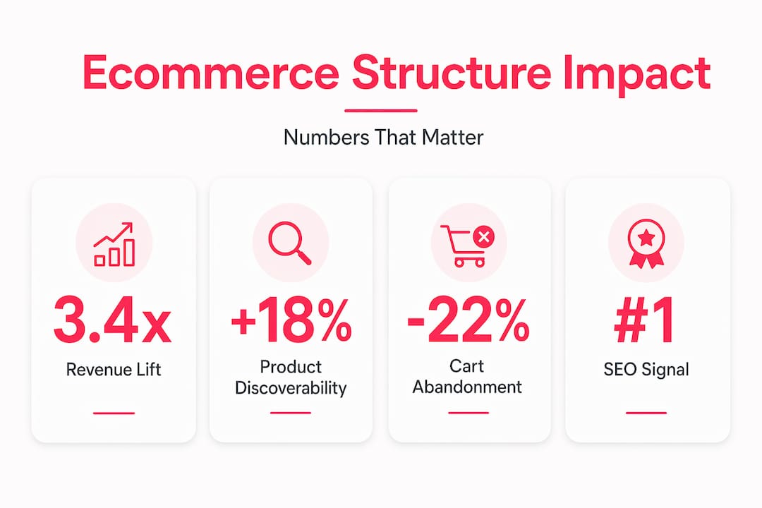
A statistic worth internalising: sites with flat, logical structures consistently outperform deep hierarchies in organic visibility for competitive product category terms. The logic is simple. The fewer clicks it takes to reach a page from your homepage, the more “important” search engines treat that page. For high-value categories, that matters enormously.
Investing in ecommerce web design that bakes SEO-friendly architecture into the build from the start, rather than retrofitting it later, saves significant rework. Pair that with smart internal linking strategies and your organic traffic ceiling rises considerably.
Performance and revenue: ROI of architecture-led improvements
After the SEO angle, let’s get into the numbers. Architecture improvements are not abstract; they produce measurable, auditable revenue outcomes.
Architecture-led performance improvements increase mobile conversion rates and annualised revenue in ways that outperform almost any other single investment category in ecommerce. Core Web Vitals, which Google uses as ranking signals, are directly influenced by your architectural decisions. Heavy navigation menus, bloated category pages loading hundreds of product tiles, and complex filter logic that fires multiple API calls all degrade Largest Contentful Paint (LCP) and Interaction to Next Paint (INP) scores. Poor scores mean lower rankings, and lower rankings mean less traffic.
“A composable architecture and UX focus delivered a 3.4× revenue lift and a 42% improvement in mobile conversion.” That figure should make every ecommerce manager sit up.
To achieve results like these in a structured, evidence-led way, follow these steps:
- Audit your current architecture using crawl tools to identify orphaned pages, excessive crawl depth, and duplicate content hotspots
- Benchmark your Core Web Vitals at the category and product page level, not just the homepage
- Map drop-off points using session recordings and funnel analytics to pinpoint where shoppers abandon journeys
- Prioritise structural changes by revenue impact: focus first on your highest-traffic category pages
- A/B test navigation and filter changes before rolling them out site-wide
- Measure post-change with consistent KPIs: conversion rate, revenue per session, and average order value
Pro Tip: Mobile should be your primary testing environment, not an afterthought. Mobile shoppers are typically faster and less tolerant of friction than desktop users, so architectural flaws surface more quickly and cost more per lost session on mobile.
If boosting conversion rates is a commercial priority, architecture deserves a ringfenced project budget, not just a line item in a UX wishlist. And if you’re thinking about the longer game, read up on how ecommerce UX for sales growth connects structural decisions to sustained revenue increases. For a deeper technical view, technical SEO for ecommerce is a useful companion to any architecture audit.
Critical trade-offs and evidence-based decision making
From showing the upside of good architecture, we now need to ground the guidance in practical reality. Because architecture decisions involve genuine trade-offs, and following trends without validating them can cause serious damage.
Architecture trade-offs are real and sometimes painful: deeper hierarchies create precise, well-targeted landing pages but risk orphaning products if taxonomy maintenance slips. Shallow structures scale more gracefully but rely heavily on data quality and filter performance to do the work that categories would otherwise handle.
A cautionary example closer to home: a UK retailer’s A/B test saw revenue and engagement fall when navigation changes didn’t match actual user expectations, despite the changes looking logical on paper. This is a critical lesson. Intuition is not a substitute for data. Neither is industry convention.
Evidence without action is just information. Action without evidence is just gambling.
Here is how to structure decisions properly:
- Gather real user data first: session recordings, heatmaps, exit surveys, and usability testing sessions before any structural change
- Define your hypothesis clearly: “Reducing the category depth from four levels to three will reduce bounce rate on subcategory pages by 10%”
- Run controlled A/B tests: split traffic between the existing and new structures, hold the test long enough for statistical significance
- Examine secondary metrics: don’t just measure conversion rate. Check time on site, pages per session, and revenue per visitor
- Document and share findings: architecture decisions should inform the whole team, not live only in a developer’s Jira ticket
When considering effective navigation approaches, resist the temptation to copy competitors without understanding their context. A mega-menu that works for a department store with 50,000 SKUs may overwhelm shoppers on a boutique store with 500. Scale and catalogue complexity always influence what structure is appropriate. If you’re preparing for significant structural change, the considerations covered in replatforming for growth are worth reviewing before you commit to a direction. And for the SEO dimension of these trade-offs, enhancing UX for SEO is a useful framework.
What most ecommerce teams miss about site architecture
Here is our honest take, built on 17 years of working with ecommerce brands across Magento and Shopify: the biggest problem with site architecture is not technical incompetence. It is organisational misalignment.
Most teams treat architecture as a dev task. Something that gets decided during the build and then left alone. But architecture is a living commercial system. Your taxonomy should reflect how your customers think about buying, not how your warehouse categorises stock. Your filter options should map to real purchase intent signals, not just product attributes someone exported from an ERP. Your internal linking should be steered by what your best customers actually search for, not what your content team finds easiest to write about.
We see a consistent missed opportunity: the people who understand buying intent (the commercial and merchandising teams) are rarely in the room when navigation and taxonomy decisions are made. And the people who understand technical constraints (developers and architects) rarely have visibility into which categories actually drive revenue. That gap is where architecture goes wrong.
The answer is not to hire a specialist information architect, though that can help. The real answer is to build cross-functional habits. Category naming decisions should involve search data. Filter design should involve customer service insights about what shoppers ask for. Navigation testing should involve the analytics team. Thinking about scalable ecommerce site strategies means embedding this collaborative approach from the start, not bolting it on when conversion rates start to slide.
Invest in people who can think in systems, those who hold the commercial goal and the shopper experience in mind simultaneously, and your architecture will compound in value year over year.
Need a hands-on site architecture partner?
If this article has surfaced questions about your own store’s structure, you’re not alone. Architecture problems are among the most common and highest-impact issues we encounter across the ecommerce brands we work with.
At Big Eye Deers, we bring together UX, technical, and commercial expertise to help ecommerce businesses build stores that actually convert. Our work across Magento web design and Shopify design and development gives us a broad view of what works across platform, catalogue size, and trading model. Whether you need a full architecture audit, a navigation redesign, or a long-term partner to support ongoing performance improvements, we’d love to talk. Visit Big Eye Deers to explore how we work and get in touch with our team.
Frequently asked questions
What are the most important elements of ecommerce site architecture?
Key elements include navigation structure, taxonomies, category pages, filtering options, and internal linking. Site architecture affects user orientation and SEO simultaneously, so these elements must be designed with both shoppers and search engines in mind.
How does site architecture impact organic search rankings?
A clear, logical structure helps search engines crawl your site efficiently, boosts product discoverability, and prevents wasted crawl budget on duplicate or low-value pages. Flat hierarchies with strong internal linking consistently outperform deep, tangled structures for organic visibility.
What are common mistakes to avoid in ecommerce site architecture?
Top mistakes include overcomplicated hierarchies, copying competitor navigation without testing it, and failing to remove orphaned or duplicate pages. A/B-tested navigation changes can actually harm sales when not validated against real user expectations first.
Does modernising site architecture really increase sales?
Yes, when done with a focus on both UX and data, the results can be dramatic. Evidence points to a 3.4× revenue lift and a 42% jump in mobile conversion from a composable architecture and UX-focused rebuild.
How do I start fixing my ecommerce site architecture?
Begin with user journey mapping across your top five purchase paths, then audit your current navigation for dead ends and orphaned pages. A/B test any structural changes before rolling them site-wide, and always measure revenue per session alongside conversion rate to capture the full impact.
Recommended


Adobe Commerce (Magento)
Formerly known as Magento, Adobe Commerce is built for complex catalogues, integrations, and long term growth. We design and develop stable, scalable stores that support demanding eCommerce requirements, including multi-store setups, complex pricing, and Hyva based performance improvements.

Bespoke Build
We design and build custom eCommerce platforms for businesses with complex workflows, integrations, or non standard requirements. Built from scratch around your business needs using Laravel and modern architectures.

Working with brands across the UK from our offices in Cardiff and Exeter, you deal directly with a senior team of designers and developers specialising in Shopify, Magento, WordPress and bespoke eCommerce platforms.
We focus on commercial outcomes. Better conversion rates, strong SEO foundations and eCommerce platforms that continue to improve long after launch.