Design for Success: the importance of ecommerce web design
Web design is an important factor when it comes to websites, and even more so for eCommerce websites. A successful eCommerce web design can help give customers a better experience and potentially lead to more sales.
In this week’s blog we will talk through a few ideas on how you can make eCommerce web design improvements on your website.
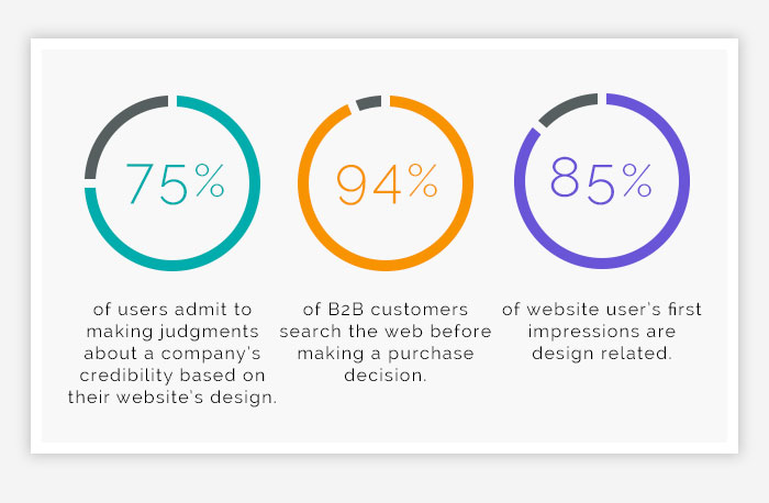
First Impression is Key
You never get another chance to make a first impression, so make it count!
Much like a shop in real life, if you stepped in for the first time and saw a messy, disorganised floor, you would probably have a negative opinion and leave. This is the same as an online store. Imagine if you landed on a webpage that had a messy layout and low-quality imagery or mismatched fonts, what would your opinion be?
So keep this in mind when designing. Take a look at competitors and see how they lay things out. Make sure to keep things clean and professional. Use high-quality imagery and make sure they have similar styling to keep everything consistent.
User Experience Design
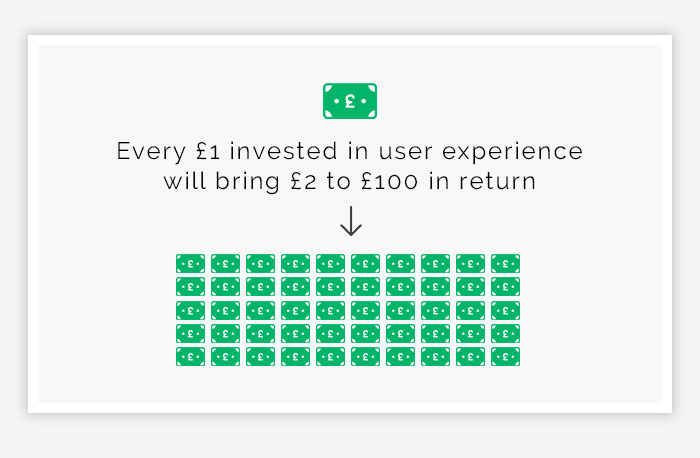
UX Design is becoming the main factor when designing a website. It is something we have discussed in our previous blogs about user experience.
It is important to make sure a website is user friendly to allow for a fluid journey from start to finish. The last thing you want is for a customer to go on your website and not know where they are going and have to search for it. Make sure everything is easy to find and it is in a way that it flows. This includes simple navigation, CTAs that show where a customer can go next, clear links for information pages such as FAQs and the contact page.
Being mobile friendly is important, so a responsive website is another point to consider when thinking about UX and eCommerce web design. You need to make sure that when your website is seen on mobile and tablet devices, it looks good. Remember the website will be seen on a smaller screen, so include large CTAs that are easy to click, clear and concise writing and a condensed menu to save space, such as using a burger menu and icons for cart and account pages.
For more info, here is another blog about Web Design and Viewer behaviour and being mobile-friendly.
Keep your Brand and Design Consistent
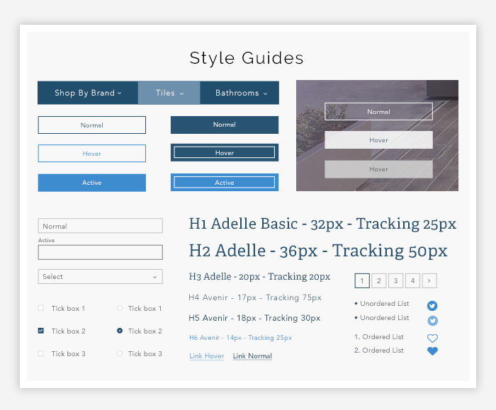
It is important to keep your brand image consistent across every platform you use, and that includes your website. If you are a wedding dress company you will likely want to make your website very delicate and pure, whereas if you are a company that deals in a survival kit, then you will want to convey something very outdoorsy and masculine.
Obviously, this all depends on who you are marketing towards as well, so just make sure to ask yourself how you want to convey your brand and what message you want to portray through your eCommerce website?
Colour Palette
Leading on from the previous point, the colour palette is very important when it comes to your brand and eCommerce website. If you have already picked colours for your brand, i.e. when you designed your logo, then you need to make sure you keep these colours in mind when choosing your website colour palette.
Choosing complementary colours is always a good idea. If you have blues in your logo, it’s good to pick cooler colours so that they complement each other. Of course, this depends on your brand, if you are a kids company then you will likely go for bright colours and choose contrasting colours, such as orange and blue.
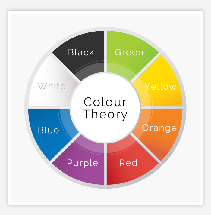
In addition to choosing colours that work well with each other, you should know that certain colours can convey different meanings. This is what is known as the Colour Theory. See below what each colour conveys
- Green: A positive colour that means fresh, harmony or wealth. It is a easy colour to digest
- Yellow: A bright colour that can represent joy, happiness, and be used as an attention grabber,
- Orange: A great bold colour that can grab attention and be used to call-to-actions. Can be aggressive if overused.
- Red: Bold colour that can represent strength, energy or passion
- Purple: Associated with royalty, can symbolise power and luxury
- Blue: A commonly used colour for professional service websites. It can be calming and clean
- White: A powerful colour that create a sense of cleanliness, and innocence. Used for minimalistic websites as it can denote peacefulness.
- Black: Another powerful colour that is associated with luxury and exclusivity. It is commonly used for highend brands and creates a sleek image
Stand Out from the Crowd
For many companies, one of the main goals is to make sure they stand out from their competition and it is no different with your eCommerce store. While it is always good to keep the layout of the store familiar to what is already out there, make sure there are elements that stand out, this could be a fun colour scheme, a popping logo or cool animations. Whatever you choose, try and add something that will make customers remember you.
A great example of this is Ouigo.com. The French trainline company already uses fun and popping colours, but went that extra step further by introducing a pinball game to the website. The fun game was incredibly fun and on-brand, and was a great customer interaction tool.
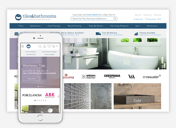
In all, when it comes to designing an eCommerce website, remember to design for your target audience as they are the ones who will be using your website and purchasing items.
If you have an eCommerce website that needs updating, or you are a new business that is looking for a brand new website, why not give us a call. We have worked our magic and have designed a number of eCommerce stores, you can see our work here. Our contact details can be found here.
If you would like more help on web design and where to get started, check out our previous blogs:
Magento
eCommerce
Magento is the leading solution for eCommerce, and we’re specialists. Magento is easy-to-use, completely customisable and endlessly scalable.

Bespoke
Builds
We offer custom web development services for any requirement. Manufacturing from scratch, we deliver a project entirely tailored to your needs.

Working with brands nationally from our offices in Cardiff and Exeter, our tenacious team of designers and developers deliver sophisticated results every time.


