Mobile First Indexing is Coming!
BIG NEWS! And we hope you heard it here first, but word on the street is Google will likely be rolling out mobile-first indexing later this year.
Meaning Google will begin looking at the mobile version of a website when indexing and determining rank signals, first. This comes as no surprise as we continue to see the growth of web traffic on mobile exponentially increase.
What is indexing?
Indexing is basically the process of adding web-pages into search engines. Google, uses spiders (don’t panic, they’re invisible and robotic) to crawl the web and index any pages it finds using an “index” meta tag. They’re then saved to a database for when a relative search term is input into a search engine, it can return results.
How will mobile-first indexing affect me?
From the moment the update commences, the mobile version of your website will automatically be considered as the primary version. So, when the spiders are crawling the web indexing web pages, it’s the mobile site that will be indexed first. If you don’t have a mobile version of your website (i.e. a responsive site) then the desktop version will be indexed instead.
Whilst the above doesn’t sound like a problem as such, there could potentially be penalties set by Google for those without a mobile website. Meaning, your indexing could be at a disadvantage where rankings are concerned.
If a mobile site is identical to the desktop version but is optimized to be responsive across devices, with structured data markup, then, in theory, you have a mobile-first website.
What can I do on my website going forward?
It’s simple, treat the mobile version of your website as though it is more important than desktop. Traditionally, mobile sites have been an afterthought with many hidden elements and less content. We will now begin to see this change, as mobile websites around the world are set to become the priority.
Increase your mobile user experience by focusing your efforts on its functionality to retain and potentially improve rankings in Google’s search engine.
How do I check if my website is responsive, and to what quality?
#1 – Search your website URL on your mobile.
This will give you a clear indication as to whether your website is responsive, and whether you have a mobile-optimized website.
#2 – Use Google’s mobile-friendly test.
Just input your URL and it will test how easily a user can interact with your page on a mobile device. A simple way to find out how Google rates a webpage.

#3 – Use Google Search console.
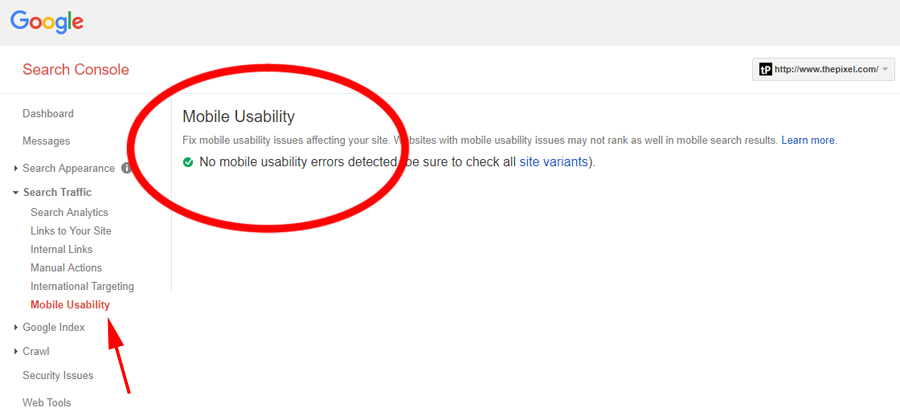
Step 2 tests one page at a time. For an overview of your entire site check ‘Search Traffic > Mobile Usability’ to uncover any pages with mobile usability issues.

#4 – Compress large files and images
Since more people are accessing websites via their mobile, they will also be using mobile data. 4G is super-fast, but not all network providers use 4G speeds yet, so make sure all large files onsite are compressed as necessary. SVG’s (scalable vector graphics) are also advised for maintaining a polished look for logos and icons because they can scale with no pixelation.
#5 – Remove obstacles for good mobile UX
If you use any media services that aren’t always available on mobile devices, ensure they are thoroughly tested and offer an alternative static version to not negatively affect your mobile experience. Ensure adverts and pop-ups work well on mobile too.
I have a dedicated mobile website, separate to the desktop version…
In that case, you need to triple-check that all content, structured data, Metadata, XML, and sitemaps are the same as your desktop site. Check that it is all up-to-date too. You will also need to verify the mobile version with Google Search Console verification.
Any issues with the above?
Speak to your webmasters. The developers of your website will be able to help, otherwise please drop us a line and we will see what we can do.
Conclusion
Mobile-first indexing is coming, whether it’s this year or the next (Google have begun slowly rolling it out) so be ahead of the game and make sure your website is ready, or face the wrath of Google’s bots and see a decline in your rankings.
We know which option we prefer.
Sources:
https://www.shoutmeloud.com/google-crawling-and-indexing.html
https://moz.com/blog/mobile-first-indexing-seo
Magento
eCommerce
Magento is the leading solution for eCommerce, and we’re specialists. Magento is easy-to-use, completely customisable and endlessly scalable.

Bespoke
Builds
We offer custom web development services for any requirement. Manufacturing from scratch, we deliver a project entirely tailored to your needs.

Working with brands nationally from our offices in Cardiff and Exeter, our tenacious team of designers and developers deliver sophisticated results every time.


