Magento 2.0 Themes: Luma vs F2
F2 is a Magento based theme designed and developed by Template Monster. This type of template style is mainly ideal for fashion stores or labels. So, if you are thinking of coming up with a new fashion store, then F2 is a good theme to consider.
In this article, we are going to talk about Magento F2 and discuss its features and functionalities that offer a store the latest web design trends that every store owner want to own.
Why Opt for Magento F2?
If you want to set up a new store but have a very tight budget, then going for free theme templates is a good way forward.
There are many themes available on the market and what is great is that they are free! Luma is one such default Magento 2.0 theme that is quite popular among developers and designers. It encompasses all the features and functions that are offered by Magento 2.0, but the difference between Luma and F2 is, with F2 you can customize and repurpose the theme just the way you like.
But that’s not it! There are quite a lot of factors that differentiate F2 from Luma, such as the home page design, the product pages, and the features and functionalities. We’ll get into each of the factors in detail so that you can understand the advantages of using F2 over Luma.
We’ll also differentiate between F2 Free Version and F2 Premium Version
The Magento based theme is now available in both the versions – free and premium. Although both the versions have been developed with user experience in mind, the premium version obviously has a far more enhanced features and functionalities.
Let’s take a close look into each of the Magento 2.0 themes…
Luma vs. F2 Free Version vs. F2 Premium Version
#1 – Home Page Design
We all know Luma is a default Magento 2 theme that offers a clean and tile-based structure to the website’s home page design.
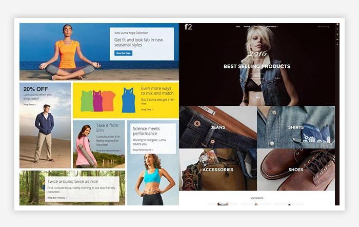
F2 also has a tile-based structure, but unlike the large hero image in the header section of Luma, F2 offers a full-width carousel slider. As a store owner, you can utilize the feature to emphasize on the store’s hot deals of the season.
Below the carousel slider, the template design comes in a flat masonry style, wherein store owners can showcase their products under different categories. Observing from a store’s design architecture point of view, F2 is more user-friendly. It has a clean and friendly template.
You begin with the hot deals (to quickly catch the customer’s attention) and then continue down with each product categories (allowing an already interested customer to window shop leisurely).
F2 offers a functional carousel product listing with the products organized as ‘New’ and ‘Special.’ If a user wants to see more from each listing, then they can click on the arrow on the front page to navigate elsewhere.
Luma, on the other hand, does not offer any slider or carousel listings. Here, the products appear under the ‘Hot Sellers’ category in grid based style.
Even regarding readability, F2 is responsive. It uses dramatic typography that looks good on all screen sizes.
Check out both the home page designs to understand the difference –
Home Page Design of Luma and F2
Now coming to the free versus the premium version:
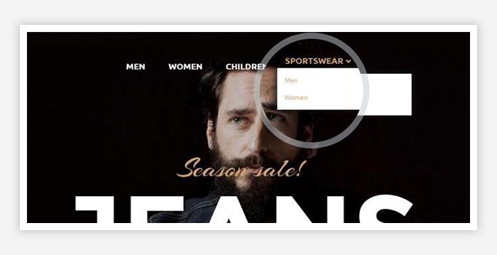
- Sticky Menu vs. Mega Menu
F2 Free Version
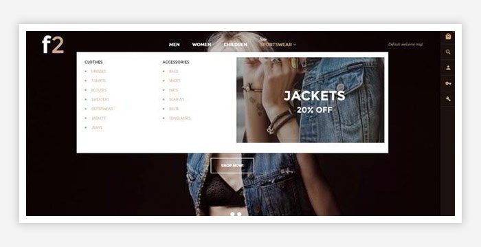
F2 Premium Version
When F2 was first designed, the free version had a sticky drop down fixed to the header of the website.
The purpose was to boost up a store’s conversion by providing shoppers with quick access to the category page. In addition to this, other features were also integrated into the sticky header, such as:
- Live search
- Shopping cart
- User’s profile
The premium version, on the other hand, features a mega menu from where shoppers can get access to multiple category pages, offers and more.
From the customer’s point of view, nothing has changed much. But from the store owner’s perspective, the premium version allows you to manage multiple elements with just the touch of your mouse cursor. Yes, you can just drag and relocate the categories without changing any line of code.
- Configurable Slider vs. Sliders with Visually Appealing Transition Effects
F2 free version features a fully configurable slider that you can manage by adding captions, offers, CTAs, and transition elements the way you want to.
In the premium version, you can make the slider carousel of F2 more informative by adding CTAs and adding transition effects that come with a better visual appeal.
- Newsletter Popup
The premium version of F2 features a popup block of the newsletter subscription form. It is placed front and center and dims out the rest of the layout. You can even tweak the pop-up design with the remainder of the theme elements to match your brand’s identity.
#2 – Category Page
Luma Category Page
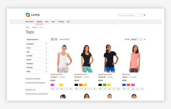
Luma features a list or grid based design layout that is concise and clear. It features product preview that includes color, star ratings, size variations as well as CTAs. The template also features pagination so that users can number the pages that they want to display their products.
The width of the page is 980 px, which is more than the default page of Magento 1.
F2 Category Page
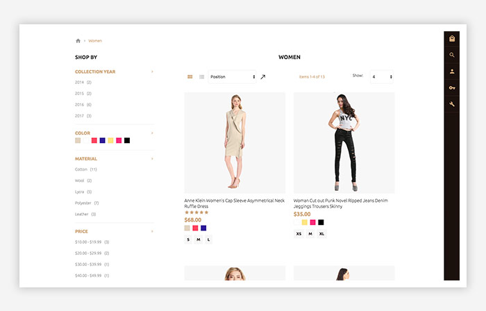
However, it is not as large as the width size of F2 that measures 2048 px. One thing that the Luma does not feature is the product filter option. In F2, customers can filter the products by the name and the price. Apart from product previews like star ratings, color, CTAs and size variations, F2 has a bigger product preview page that allows customers to take a look at each item from a close range.
How F2 Free Version Differs from the Premium Version
- Ajax Compare Option
The free version does not have the ‘Add to Compare’ option. It is only available in the premium version. With this feature, users can compare several items based on their description, size, color, material, etc. With each page reload, the items get added to the compare list, allowing shoppers the freedom to browse the inventory without any distractions.
- Ajax Wishlist
This is another feature that is not available in the F2 free version and comes added to all the items available in the store.
You can find this in both the category and in the product page of your website. Shoppers can add individual items to the wish list while they are browsing the category or the product page.
While on the category page, the wish list is available only for mouse-over on individual products, the feature is always accessible to users on the product page.
#3 – Product Page
Both Luma and F2 have product pages that are defined blocks with product details, information, and reviews. The information appears to the right side of the product image.
Though both of the template pages share common features, there are still some functions that differentiate them. For example, options like ‘Related Products’ and display blocks showcasing other products that customers might like are some of the features that Luma does not have. It appears in the carousel product list.
Luma’s product page, on the other hand, showcases the product along with the product details and images, displayed in a grid based view.
The horizontal carousel product list adds more interactivity and functionality to the page. Retailers and store owners can use this feature to showcase a maximum of four products at a time. Each of the products is labeled with a ‘New’ or ‘Sale’ badge.
The F2 template also features configurable swatches on their product pages. This gives users the opportunity to preview items in particular color, size, and fabric.
There is not much difference in the template design and style when we try to compare the free version and the premium version.
#4 – Another Additional Feature
The premium version of F2 supports a multi-language pop-up support, a feature that is not available in either the free version or in Luma’s template.
Conclusion
That’s it! I hope this article provides you with the information you need to identify the difference between Luma and F2, and decide whether or not F2 free or premium version suits your needs.
Magento F2 obviously comes with more features and functionalities compared to Luma. If you have plans to set up a store with little fancy features and functionalities, then installing Luma or F2 free version template theme would be ideal here. The templates will provide you all the features and functionalities to build an e-store.
However, if you want a store with sophisticated features and functionalities, then download the premium version of F2. Check out their product demo if you want to learn more about the template theme. Let’s look forward to showing how the template modules and extension can take online shopping experience to a whole new level.
If you want to talk through the different themes of Magento 2.0, or you want a custom / bespoke website, then why not give us a call? We are Magento certified and have years of experience creating bespoke websites for a range of clients!
Magento
eCommerce
Magento is the leading solution for eCommerce, and we’re specialists. Magento is easy-to-use, completely customisable and endlessly scalable.

Bespoke
Builds
We offer custom web development services for any requirement. Manufacturing from scratch, we deliver a project entirely tailored to your needs.
Working with brands nationally from our offices in Cardiff and Exeter, our tenacious team of designers and developers deliver sophisticated results every time.


