Don’t let flat design fall flat!
BED love flat design and use it left, right and centre when we can!
The basic introduction to flat design is that it is a 2D style that removes any effects that create depth such as drop shadows, bevels, embossing and gradients. No feathered edges or shadows are used, just clear lines and simple shapes. It’s a recent trend that divides designers as to whether to love or hate! We love the simplicity, focussing websites on user experience with easy to navigate user interfaces.
We thought we’d break down the elements that make up great flat design with some of our favourite examples:
1. Simple shapes and icons
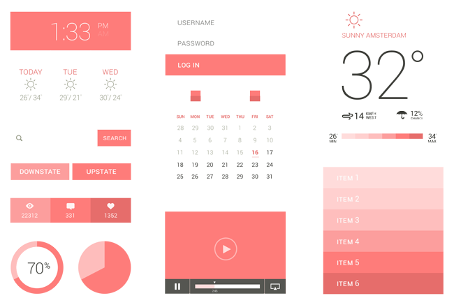
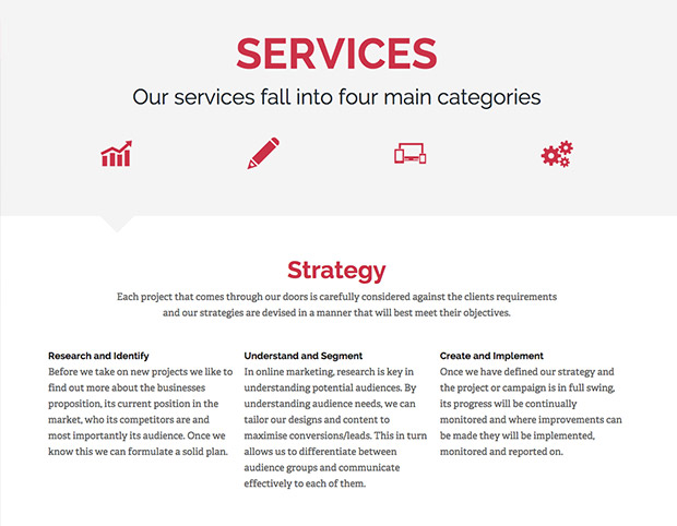
User interface needs to be simple and obvious. Stripping back effects can make it harder to highlight the important areas of a web page but flat design battles this with the use of icons and simple shapes. Icons are a great way to strip out bulky content by being a universal language to direct the user. Clickables can be highlighted with the bold icons or by using bold colours to direct attention.
2. Buttons
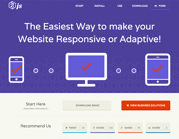
If not an icon to click then a button, in flat design these need to be bold colours and simple shapes to allow them to stand alone from the rest of the content. Use colour, outlining, boxing, a different typeface or shape that is consistent throughout your site to improve user experience.
3. Typography
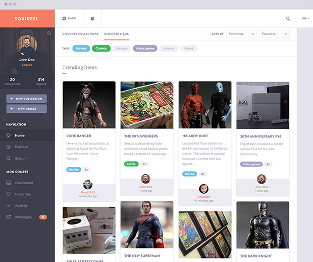
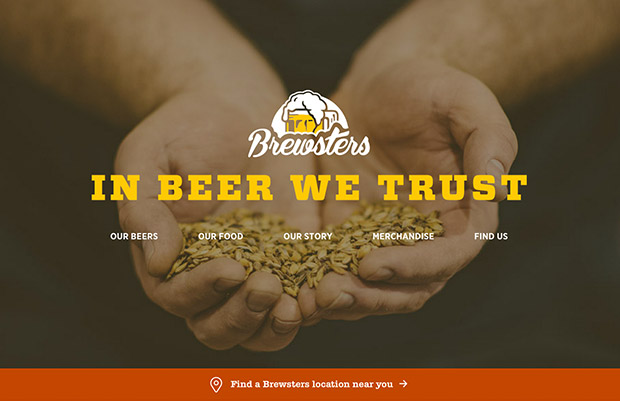
The font needs to keep in with the simple, clean design and continue the tone of the design scheme. Opt for a simple sans serif that comes with plenty of variations and weights. A font that is too busy or multiple fonts will clutter the page quickly so try to use just the simple sans serif (plus its variations) with one additional novelty font to direct the eye to the more creative areas. The simple background will allow the font to stand out and continue the atmosphere of the site.
4. Colour
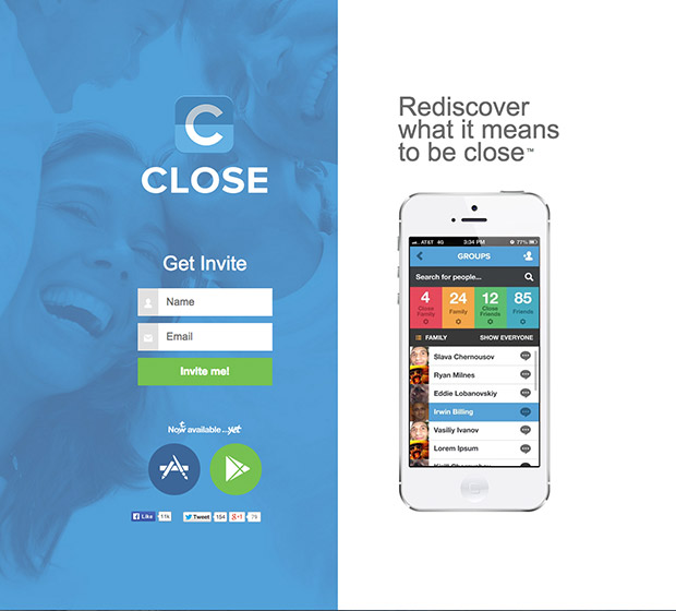
You guessed it… keep it simple and clean! Flat design uses a more colourful colour palette with more hues, removing any use of tints or tones. Colour blocking helps create direction on the page and direct the eye where you would like it to go most. Flat design works great with black and white but the bright colours really help make a site stand out. Use consistent colours for buttons or page groups as this will help the site flow more as the user learns how to move through it best. An overused colour can lost its meaning so be conscious to not over do it.
5. Content
The content needs to match the design, the more concise the better! The word count should be minimised for a pure user experience basis so that the visitor doesn’t have to plough through content to find the information they want or where they need to go. The reduced blocks of text also fit in with the minimalistic style of flat design. Less copy allows the visitor to skim read and navigate the page quickly which fits in with the attention span of modern users.
6. Hierachy
In any design, the hierarchy of the page needs to be obvious but this can be more difficult with flat design. Use of colour and blocks will help the structure of the page. You could sway more towards ‘almost’ flat design (see below) and use bevel and shadow to lift the necessary areas of the page.
7. ‘Almost’ Flat Design
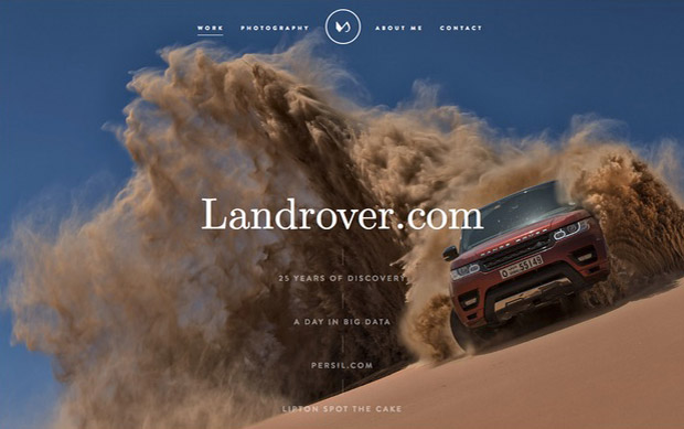
If you feel flat is too much and too simple, you can add a few little effects that can lift the page out of pure 2D styling. This has to be separated to satisfy the purists of flat design but the addition of slight gradients or drop shadows allows flexibility to the design. This can help reduce the harshness and ‘boxiness’ of pure flat and help guide the user through the pages by adding depth and texture.
Magento
eCommerce
Magento is the leading solution for eCommerce, and we’re specialists. Magento is easy-to-use, completely customisable and endlessly scalable.

Bespoke
Builds
We offer custom web development services for any requirement. Manufacturing from scratch, we deliver a project entirely tailored to your needs.
Working with brands nationally from our offices in Cardiff and Exeter, our tenacious team of designers and developers deliver sophisticated results every time.


