Design Trends of 2017
Louder, Brighter Colours & Transitions
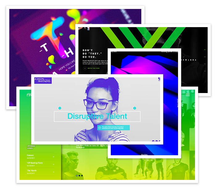
Over the past few years many of the big brand leaders have followed a very safe and muted colour palette to create a very clean and controlled design scheme. But now that is quite the opposite, especially seen towards the end of 2016 and going into 2017.
With the likes of spotify and instagram redesign swapping out those boring colour schemes for something more vibrant and in your face in situ with those neutral backgrounds, this certainly helps these days with everyone fighting for real estate on social media and billboards. Strong bold branding like this will help you get noticed in 2017.
Bold Typography
Bold Typography will also be a popular means to catch the readers this year. It was seen in 2016 but this year it will be more daring with font choice and size. Thanks to the ever popular Google fonts and the vast amount of free font sites out there, it has made creatives as well as users more visually conscious of fonts these days, which can only be a good thing.
There are now some great examples of this on the web and also on social media where companies are now using big bold text to grab the reader’s attention. This is more important now than ever with Mobile tipping the scales on usage and remarkably high definition screens will also increase the need for bold fonts.
Custom Hand Drawn Graphics & Icons
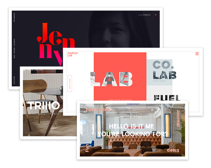
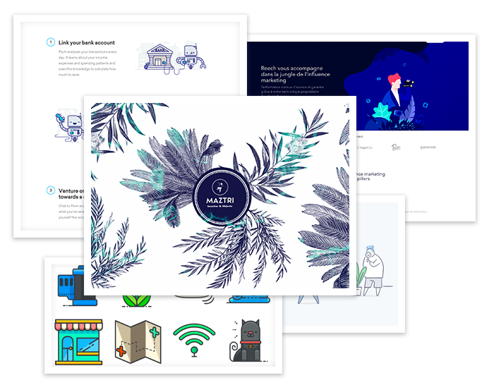
Many may see this trend as childish or unprofessional, but it will definitely help you stand out online. Like many of the trends in 2017, this is a push back on the clean and almost clinical nature of design in recent years.
With the need for companies to become more ‘original’ and to stand out from the crowd, hand drawn and custom illustrations have become more in demand than ever before. The Modern Retro style of recent years has seen brands embrace this as they look to differentiate themselves from the pack, such as Nike and every other major fashion brand using custom illustrations in their advertisements and sites. This adds a much more personal element back into the design which can’t always be done with stock icons or graphics.
Some may say this style/ trend can look childish at times but it will certainly help you stand out online, especially as, like many of the 2017 trends, this is a juxtapose on the clean and clinical design styles in recent years
Dropbox has adopted the use of hand-drawn illustrations in their branding and online presence and is now easily recognizable.
Micro Interactions
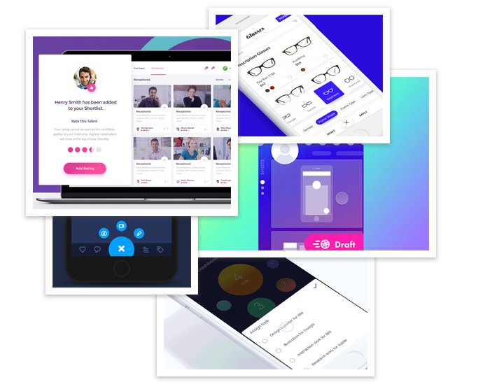
With mobile now overtaking desktop usage, micro interactions have become more popular due to responsive and real estate issues where the user is interacting with the site such as liking a post, sending a message or filling in a form field. The purpose of micro interactions during these moments is to provide guidance and feedback for the user. These become part of the natural way users interact with products and services, and is a great way to build habits with users while also improving UX.
More 3D
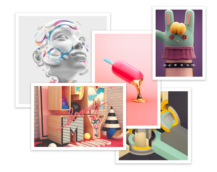
The use of 3D has been on the rise over the last couple of years, from 3D printing and VR sites, to full scale 3D product rendering on ecommerce websites, and it is no surprise that the 3D trend has also crept into web design.
Art and design resource, Creative Bloq reported that geometric patterns are cropping up in illustrations, product packaging, and branding efforts, and this is part thanks to the popularity of CSS3 3C Transform and Web GL.
3D is definitely heading our way and we are going to see its influence in all design fields. With the VR revolution rapidly building momentum, this area is evolving pretty fast and we are excited to see how it takes shape!
Modular Design
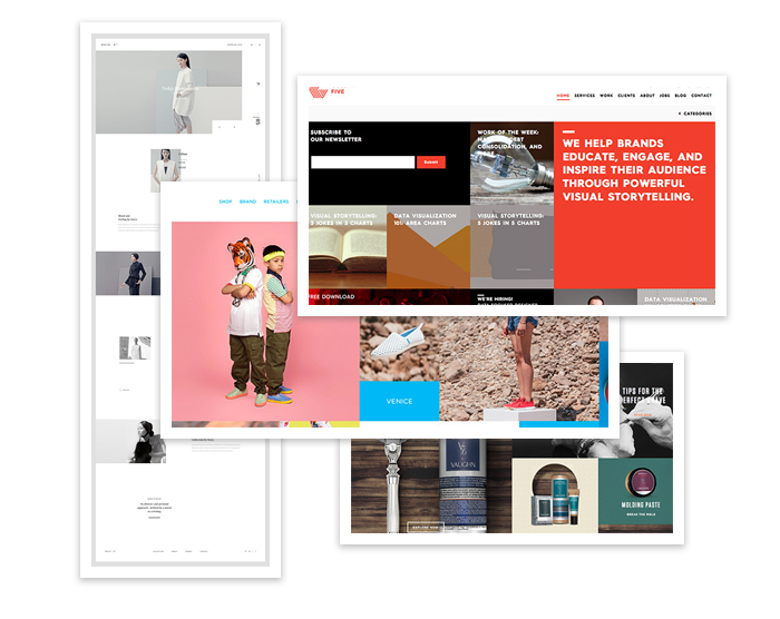
As well as a lot of great technology products being modular, it is also being used on some great websites. Modular site designs has been around for awhile now and it’s nothing new, but it has definitely become more popular in the last couple of years with the help of advancements in web development that has made it run much smoother.
Modular grids provide a balanced layout by dividing up your content into equal measures, but the ability to span multiple columns ensures the content appears interesting and dynamic.
360 Video & VR
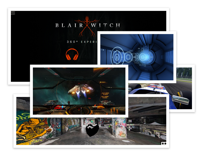
VR burst on to the scene in 2016 with numerous gaming VR headsets being released. 360 video as well has seen a surge in search interest with many platforms using it such as Facebook and YouTube.
It was a talking point at this year’s Awwwards and here at Big Eye Deers, we are excited to see what 2017 has in store for VR and 360. In particular, we are excited to see how creatives will incorporate both into web design…. even if browsers won’t be ready to support it…
We love keeping up-to-date with design trends and try to incorporate them within our own website or our client’s websites. If you are looking for a website refresh and get your website looking modern, why not give us a shout and see what we can do for you. We are based in both the lovely Cardiff Bay in South Wales and also sunny Bude down in Cornwall, so can service both South West England and the South of Wales. You can contact us here.
Magento
eCommerce
Magento is the leading solution for eCommerce, and we’re specialists. Magento is easy-to-use, completely customisable and endlessly scalable.

Bespoke
Builds
We offer custom web development services for any requirement. Manufacturing from scratch, we deliver a project entirely tailored to your needs.
Working with brands nationally from our offices in Cardiff and Exeter, our tenacious team of designers and developers deliver sophisticated results every time.


