Big Eye Deers Get a New Design!
After 2 long years, our Big Eye Deers site had started to look as tatty as Cinderella’s old rags. It was high time that a metaphorical wand was waved, to get it looking sexy for the big wide web again.
We look after our clients sites and regularly give them cheeky face lifts to ensure that they can bring their A game when it matters most. But somewhere along the way, we’ve neglected our own – it was getting tired, worn out, and in much need of some TLC.
The magical transformation you now see before your eye holes, is a combination of three key ingredients –
- some big tasty project releases
- a dash of team spirit
- and a big wet dollop of personality
Designing our BED
Summoning the inspiration to work on your own site’s web design as an agency is never easy, it’s always very difficult to look at your brand objectively and plan a revamp. We’ve started the design process a few times before, but within a fortnight, we’ve changed our minds to incorporate a new trend or technique . This time was going to be different, very different.
So, off we trundled to Costa Coffee armed with our Macs, iPads and stacks of notes. We all gave a short presentation on what we liked and what we didn’t like in the world of web and life in general. We learnt some interesting things, like Michaela eats the outside of a mince pie, but spews out the best bit. Zak takes no sugar at all in his tea, but crams 17 spoonfuls into a latte…all good to know of course, but very off topic.
Anyway, back to the web design stuff. Interestingly, we all agreed that the new website and brand had to be dynamic, interactive and memorable, BUT most importantly it had to have personality. As a team we’re pretty off-the-wall, so the new website needed to reflect that and then some.
With the prerequisites agreed, we were well on our way! We decided to keep the BED pink as the lead colour, and really run wild with some bold design to maximise our case studies and portfolio variation.
That’s when the magic happened ;-)
Building our new BED
Web development is never smooth and the build was challenging to say the least. From CSS animations to crazy canvas elements, this had to be beyond wow! We wanted a website that didn’t have that “Generic agency look” that so many seem to have adopted. With our unique concepts, some slick designs and a few cheesy mugshots, we were able to get the look we were aiming for.
While jazzy animations are all well and good, too many can get irritating for users very quickly. On several occasions we had to stop ourselves getting too excited and carried away, having to stop to re-evaluate whether what we were adding was strictly necessary – if it added to the user experience it stayed, if it was pointless we canned it.
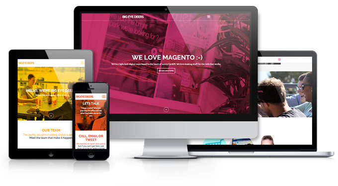
Developing a completely responsive site with so many different interactive elements raised it’s own challenges. Making sure all of our hard work looked tip top on such a variety of devices took a lot of careful consideration and a good amount of technical wizardry.
We’ve added parallax blocks throughout to show off our beautiful faces and the deer dungeon – the place where we fight crime against bad websites and our wave magic wands to create spangly new ones.
Having fun with our BED
In lieu of our new site, we planned an exciting couple of days.
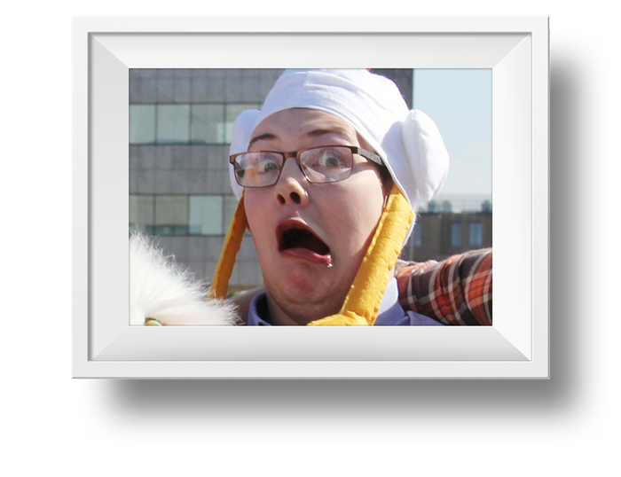
First off, we got hold of a man with cameras, and we planned for him come to the office for the whole day. We force fed him a weird combination of tea, biscuits and beer, on the promise that he’d take some decent shots of us for the site. We basically pretended to work and paraded around the Bay being papped like mega stars; mega stars of the digital world as our clients call us …ok, so they don’t say that out loud, but that’s what they are all thinking!
Did we learn anything from our day of pretending to be famous? Well, let me tell you, we learned that Ben cannot take one single decent photo. Actually, the ones of the back of his head aren’t bad.
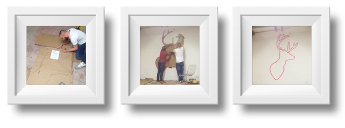
On another day, in the run up to launch, we decided to make use of a tin of old spray paint that was lying around the office. Gethin was challenged to design and create a masterpiece which we would then showcase on the new site – no matter how crap it might have turned out, it was going to get pride of place!
Geth grabbed some cardboard and decided to make a giant stencil of a deer head. We no longer have a blank wall outside the entrance to the office, it was just crying out for some attention and now it is well and truly BED-ified.
The third and final bit of fun we had before launch, was an outing to Boulders. Why? Why not! Our events calendar is full of weird and wonderful things. Trust me, this was the least bizarre!
While trying to climb walls, we saw many things…
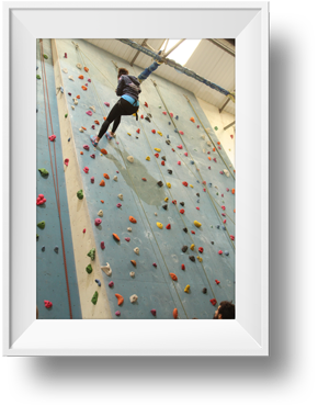
Have you ever seen a spider pig? That was Ben scurrying up the wall with a gob full of Krispy Kremes and a little helping hand from a reinforced rope pulley system.
Have you ever seen someone with an injured shoulder scale a mountain? That’s our Steve, faster than a lightning bolt he was up that wall – we all think he pretends for attention.
Gethin and Zak were also there, but their stories aren’t as funny. They just climbed up the walls like blinkin’ pro’s.
So, all these things were thrown into the mix to create the BED site you see before you. It took a great deal of time to get right, but boy did we have a blast getting it ready. From inception, through to design, content and build – our vision of what we wanted for the site is now Finally here!
We are all really happy with the new website and think the new site reflects us and showcases our portfolio well. The web design is modern and gives our brand a personality and we have incorporated fun CSS and animations that showcase our skills as web developers. A+ for Big Eye Deers! *Pat on the back*
If you have an idea for a project and you’re not sure what your options are, then why not come and talk to us about! We have over 40 years combined experience in web design, web development and marketing, and have worked with both Magento and WordPress. If you like what you see on our case studies page then contact us here!
Magento
eCommerce
Magento is the leading solution for eCommerce, and we’re specialists. Magento is easy-to-use, completely customisable and endlessly scalable.
Bespoke
Builds
We offer custom web development services for any requirement. Manufacturing from scratch, we deliver a project entirely tailored to your needs.
Working with brands nationally from our offices in Cardiff and Exeter, our tenacious team of designers and developers deliver sophisticated results every time.


