New Homepage Lands on Citywing Site
Citywing has been with us since 2006. We’ve been through a massive re-brand with them and since, been looking after their marketing and maintenance.
We are always looking at ways to help improve their website and a couple years ago designed them a brand new homepage to help increase conversions. More recently, we reviewed their homepage again and thought it could do with a bit of an update, while also tweaking areas to improve functionality and make it more streamline so visitors can find things easier.
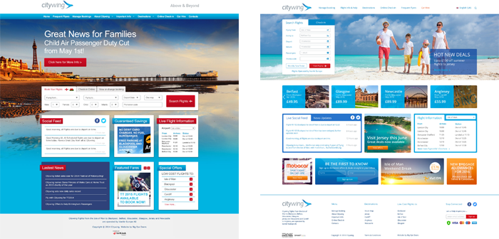
After researching current design trends and scoping out their competitors website, we put together Citywing’s new homepage. Below is what we changed:
Improve user experience
- We streamlined the navigation of the menu so that it is easier for users to find the information the need
- Added a footer to the website to offer visitors another way to move through the site and see all destinations available
- We added a language menu ready for when the Welsh website was ready
Increase user engagement
- We added a grid of blocks below the main image to help promote destinations and prices. By adding the blocks to the homepage, users will instantly see what flights are available
- We added a newsletter sign-up area to the homepage to help encourage people to sign up
- Moved the booking widget higher up the page to make it more prominent, we also include an offers CTA near the widget to help encourage visitors to look for flights.
Cleaner layout
- We condensed the navigation and moved it to help reduce clutter in the header
- The background image was changed into a slider to give the full homepage a cleaner feel, while white space around CTAs help draw attention to them
- Condensed the links in the footer to make it look less cluttered
Comparing the old and new site side-by-side, the new site feels more up to date. Breaking up the picture and the blocks, and leaving white space gives the page a cleaner look, making it more professional, while moving the booking widget up and adding in the destination blocks gives the page a more welcoming feel, helping engage customers.
At Big Eye Deers, we always want to make sure our clients are getting the best from their website by keeping up with the latest trends and improving user experience to help drive traffic and sales. We are happy with the way Citywing’s new homepage came out and are confident it will help increase user engagement.
Why not check out Citywing’s new homepage HERE.
If you are looking for a brand new homepage or website, come and talk to us about all your options. You can find our contact details here!
Magento
eCommerce
Magento is the leading solution for eCommerce, and we’re specialists. Magento is easy-to-use, completely customisable and endlessly scalable.

Bespoke
Builds
We offer custom web development services for any requirement. Manufacturing from scratch, we deliver a project entirely tailored to your needs.

Working with brands nationally from our offices in Cardiff and Exeter, our tenacious team of designers and developers deliver sophisticated results every time.


