5 Top Tips for Better Web Design
There are some really simple ways to keep people engaged when they land on your site and to keep them looking for longer! Imagine you are visiting a website, what do you look for? A great user experience is key to reducing the exit and bounce rate from your site and keep them coming back. Simple, clear and attractive websites will lead the way in the web design world. Here are a few of BED’s secret tricks to optimise the UX of your site:
Lightning Fast Pages
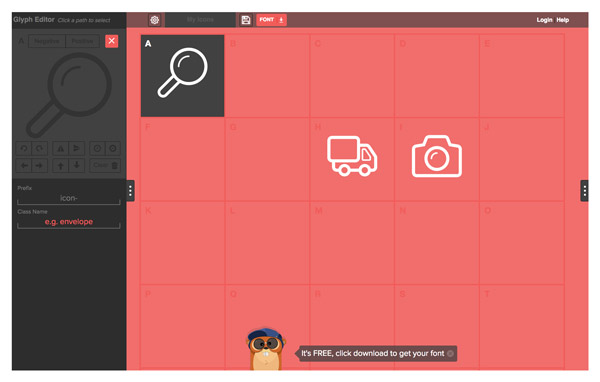
There is nothing worse than a slow website. Very few people will have the patience of any more than a few seconds for a page to load before they close off the tab and look elsewhere. Build your site to the modern-day attention span! The one crime for this tends to be having images that are far too large for your site. Optimise image sizes by using features such as the ‘Save for Web and Devices’ function on Photoshop or even websites devoted to shedding image bulk such as TinyJPG.
Symbols for Sign Posts
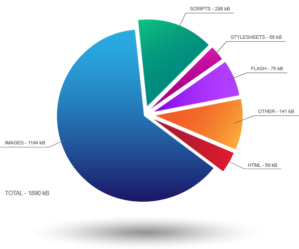
Any page with far too much text and information over load will be an instant turn off to visitors. By using symbols to help visitors navigate your website, the experience will be quicker and smoother for them – keeping the customer smiling! Symbols provide maximum impact without using text and reducing the clutter of your page. Icon fonts can be used to behave like text, scale them, use as vectors and are customisable by CSS!

Make it Mobile
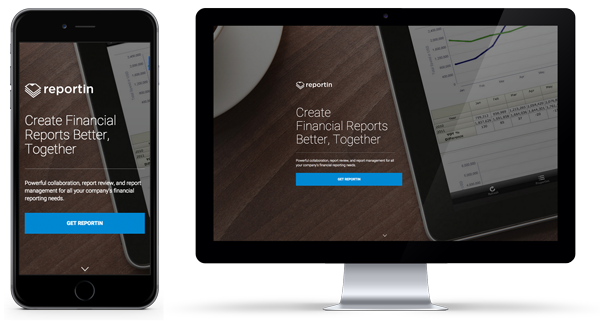
Recently, there has been a staggering increase in the number of people visiting websites through mobile devices. Designers and developers now have to create a page whilst thinking about the millions of variations a user could be viewing the website on. Keep the designs simple for mobile and ensure that content is easy to access and read. Adapt the text with the device, keep it concise and do not make them zoom!
Visual Hierachy: F and Z Scanning
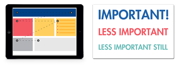
Once again, feed the mind of a short attention span! The majority of visitors will be using either F or Z reading patterns as they scan the page for the information they want. Position the features of your pages in suitable areas, keep the logo at the focal point and read everything from left to right. Buttons at the top left will get more clicks than top right as the first point of focus is top left for example. The consistent use of typography and colours to indicate to the reader the most important information implements the visual hierachy to help visitors easily scan and pull out what they need quickly.
Scroll and Engage
One of the newest tricks in design! Parallax scrolling on websites helps engage the interest of visitors with eye catching graphics intertwined with scrolling. Having different elements that individually move as you scroll down the page encourages the visitor to scroll even further. This way you have a better chance of them reading content and moving further in to the website. Not sure what we’re talking about? Here’s a couple of our favourite websites that use this technique: Seattle Space Needle and, one for the gin drinkers, Hendrick’s Gin. Stats have revealed that Parallax scrolling can increase engagement by 70%!
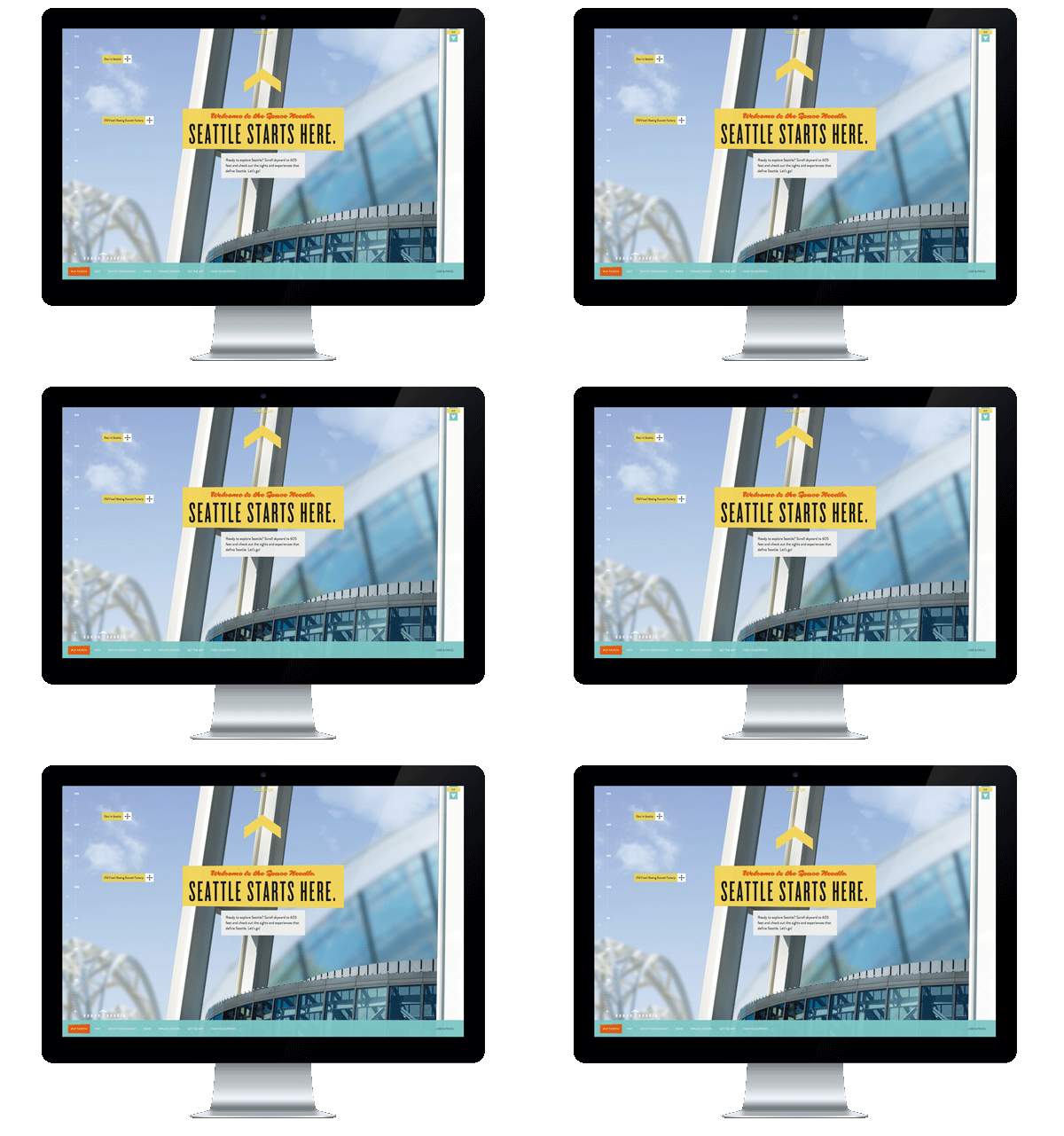
These are just a few of many tips! Always worth keeping an eye on our blogs and tweets for the breakdown of advice tips to keep your website up-to-date with the latest design trends and user needs!
Magento
eCommerce
Magento is the leading solution for eCommerce, and we’re specialists. Magento is easy-to-use, completely customisable and endlessly scalable.

Bespoke
Builds
We offer custom web development services for any requirement. Manufacturing from scratch, we deliver a project entirely tailored to your needs.

Working with brands nationally from our offices in Cardiff and Exeter, our tenacious team of designers and developers deliver sophisticated results every time.
