10 Web Page Design Tips For Your Small Business
It’s now more important than ever to have a web presence. With the influx of small online businesses popping up it is now also easier to be online thanks to the likes of CMS systems such as WordPress and Magento.
With that said, you still need to make sure your site is user-friendly, looks good across all devices and more so be SEO Friendly. With these simple web design elements below we can help you and your business on its way.
Also don’t forget to check out our recent design blog on 2017 design trends for some inspiration and to stay ahead of the game.
1. Simple navigation
The navigation is one of the most important elements on a page. You want to keep your nav as visible and accessible as possible for the users so they can browse through your site with ease – this should be high on your list of hierarchical elements. Keep it bold, simple and the text legible.
The easier it is for the user to navigate around your site, the quicker they’ll complete their desired action and are more likely to return to your site.
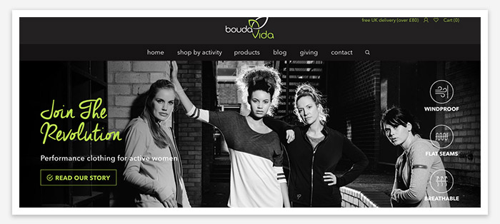
2. Colour scheme
It is easy to fall into the trap of using multiple colours and even over using colours, particularly if you’re not a web designer. We advise you should use your select colours wisely. The colour scheme of the web site should reflect your business’ colour palette, i.e the logo, thus beginning a minimal palette otherwise you site could look and feel chaotic.
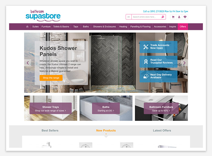
3. Stand-out images
Having striking imagery is a must to draw the user in and show off your products. There’s nothing worse than low quality images on a site – it’s a real put off and can devalue your business. If you can’t afford to take professional shots, stock photo sites are just as good, such as shutterstock or free stock stites like unsplash – so there’s no excuse! Be sure to optimise your images by using descriptive file names, reduce its size, alt tags and title tags.
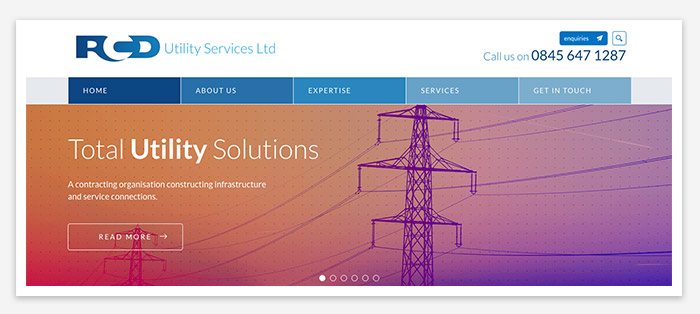
4. Strong call-to-action
Call-to-actions (or CTAs) are important as they let the user know where or what to do next on the site; whether it’s to provide information, make a purchase, sign up for a newsletter or just to navigate to another page. Consider making the buttons stand out to the user. This could be as simple as an action and a contrasting colour from your palette with a different font weight to the other text on the page. The size of the button can also help. Regarding the text, it should say what you want them to do such as: “Add to basket”,”Sign up”, “View more”, or “Submit”, etc.
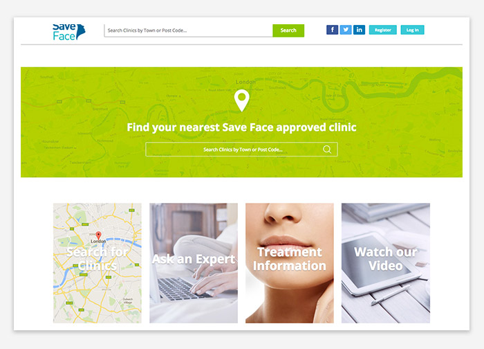
5. Your business information
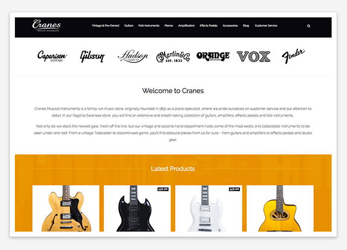
It’s good to show information about your business on the homepage somewhere or at least have a CTA to the “About Us” page. People like to see what your company is all about, your history and what services and products you provide. Don’t forget to put important information such as whether you have a physical store, what are your business hours, etc.
6. Contact information
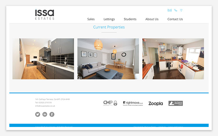
Make sure to clearly show your contact information in the footer or include a CTA to your contact details. It is best practice to include your phone number, address and an email that is professional and trustworthy.
7. Social media presence
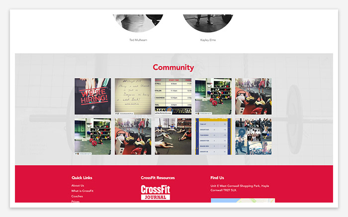
Social links such as Facebook and Twitter usually found in the footer are helpful for the user as it gives them a channel for interaction with you, but also makes the business more credible. These channel can help drive traffic to your site and are also a great way to promote offers and services. So, if you want to grow your business online, creating and maintaining a social media presence is a must.
8. Mobile-friendliness
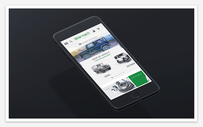
We are all now using mobile devices to surf the web. Whether it’s to do research, read reviews or purchase items, the tables have turned on desktop usage to mobile, and now that google is taking into account mobile friendliness for ranking it’s crucial that your site is responsive.
9. Web hosting that will grow with your business
Site load time is also high on the agenda these days. Google takes this into account with regards to ranking and more so your visitors will leave your site after 2 seconds if it isn’t loaded.
You need to make sure the hosting server is suitable for your site and the amount of content and traffic you are receiving. The hosting package you choose can have a huge impact on the speed and the performance of your site. A good hosting company should give you options of different packages so you can choose which one is more suitable for you with the option of upscaling your plan/server.

10. Optimisation
Not only does your site pages have to look good, they also have to work correctly. Take broken links for example, these can damage the reputation of your site and drive visitors away.
Your site needs to be content rich, utilising both long-tail and short keywords and also must be updated to be kept fresh. Make sure the product descriptions are at least 150 words long. The page titles of your site should have keyword phrases but also be descriptive for the reader, they should not exceed 70 characters. Don’t forget to link your content to other pages on your site that will benefit the user.
Magento
eCommerce
Magento is the leading solution for eCommerce, and we’re specialists. Magento is easy-to-use, completely customisable and endlessly scalable.

Bespoke
Builds
We offer custom web development services for any requirement. Manufacturing from scratch, we deliver a project entirely tailored to your needs.
Working with brands nationally from our offices in Cardiff and Exeter, our tenacious team of designers and developers deliver sophisticated results every time.


